We were suppose to start filming our Illuminati piece but
Danny didn’t not get the candles. He said he would yesterday since he had work.
He didn’t. … He then said he would get it during break still didn’t… So today
we don’t have any filming to do. He says we will do it Monday im not sure I may
be busy but mostly if we do it I don’t mind . we start schedule and decide to shoot Monday. We then
start reminiscing (talking about what we have talk about before) Danny then says
we should go to London for our government scene which I thing is a good idea
and one of them mentions to do it during our half term break. I then bring up
the auditions that we will do. We decide it will be the 8th of February.
Tyrell then holds me at gun point(with a toy gun) going james bond. We then go
back to the half term thing and tyrell says it should just be on the weekend. I
then think I should make a valid paper that shows what the auditions will need.
We were able to assemble who we would want in our title sequence
with a cast of potential people.
Government- Danny, Tio, Georgia, libby, james, Frankie,
Tyrell, Aflie E, AAflie, Sammy, Amy, Jasmine, James yr12, David, Ben
And get conedl.
The Genre of our film is Action/thriller sub genre dystopian
but Our boss Sinead says shes not sure how it’s a thriller and I agree with her
so we have to still iron out the plan a bit more.
Create the opening titles of a new fiction film to last no more than 2 minutes. (NB You must not use copyrighted sound)
My new partners in crime for my new task is Danny Wright and Tyrell Bibbiani.
Marks
Research & Planning (Blog): 20
Title Sequences: 60
Evaluation: 20
Deadline: 24th of March 2016
the first cut will be screened 2 weeks earlier so around 10th of March
22nd of Febuary is the shooting dealine all of our footage needs to be done
Task 1
- You have to invent a new fiction film, it may be any genere
- In your groups, brainstorm possible film ideas. When you have 3 come up with a logline(one line summary) for each
- Note: whatever idea you settle on, you will have to make the title sequence and it will have to be conventianal to the genre you've chosen. So unless you've got a space suit at home, a film set in space might nat be a great idea. In the past, action, horror, thriller/ suspense,
Pitch Perfect
Aims: to be able to indicate the conventions of a pictch
and a presentation for your film.
1st pitch should be breif one short sentence should be perfect.
2nd people should already understand the building blocks of the pitch: buses, bombs, jaws, space, the seven deadly sins
The pitch combines the building blocks by using analogy, synthesis, juxtaposition example
jaws in space
A bomb on a bus
Snakes on a plane
1st pitch
2 what is the film really about
3rd
Research
- what os the genre of the film?
- what other films in this genre have inspired your film/is your film similar to?
-Who is the targeted audience for your film?
-When will your film be released (summer,spring, autum, winter, awards season)
-How much money will your film cost
-how much money will your film make? demesticly and worldwide
You need to remember N.I.C.S how do
u define genere
N- Narrative story line, make it concrete
I-
Iconography what key figures give u that it’s the
C- Characters whos in it, know the cast
S- Settings Where it takes place
Dr.No
the title sequence gives key iconography establishes the genre with clear imagery. It tells the viewer that the film is about spys by seeing a noticeable feature in the top corner which resembles the 007 films which is a franchise with a large fan base. Now spy is a sub genre but immediately they establish spy with action to deem the film a action film. It also shows generic iconography with the point of view of a bullet in the barrel.
SPLICE
The films title sequence looks like a green like an alien but veins. The visual elements in it are consistent but it is not generic like Dr,No. It is a sc-fi film about genetic modification. the films makes me think nature with green.
The back up plan
It seems like a chick flick but a comedy with the flasher which seems like a hyrbid as you see a couple together. It also has a group of tvs showing babies which make it seem like it has a baby element. The animation style and typography is very feminine which suggest again it is a chick flick.
A series of Unfortunate Events
The film suggests to be a family Gothic film with children as the protagonist as you see a focus of children in one of the pictures. It seems Gothic due to the plague of black on each picture. It appears to be strange and away from normal day life. It also is in animation suggest again it is for children.
This means War
The film suggest that it is spy once again with the 007 theme of naked woman, It also has explosions which show it is Action with a sub genre of spy.
CLASS ANALYSIS__________________________________________________________________
Missions Impossible 4
It has generic spy music and the title sequence shows a fusing moving forward and the title sequences shows Tom cruises names several times and most know he is a action start. They then show generic iconography with the bullet in the barrel while playing fast place jazz and the film, then shows point of views at unconventional times. It also shows the parts of the film. The setting shows the opening screen then the title sequence like in most spy films and they seem to be under ground sneaking into it. They then move to museums to elevator shafts to stair cases and underwater showing the different settings used in the film moving rockets to bullets showing sky scrapers and everything is viewed in the point of data and they show car chases and bad guys. they also show pictures and documents being burnt like burning of evidence.
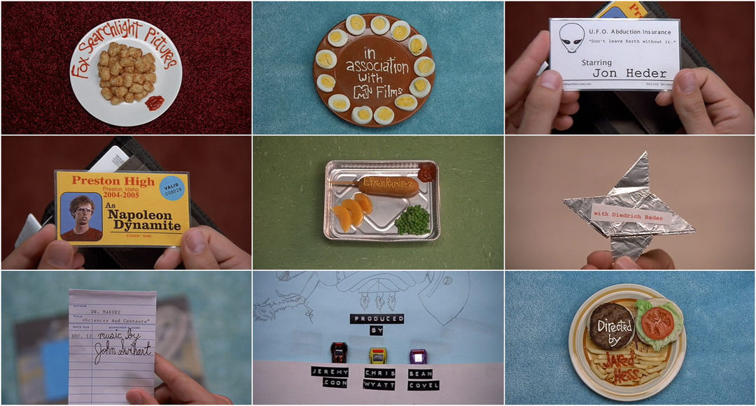
Naploeon Dynomite
The film has a weird sound track with upbeat music and a instrument layering it. It then shows the people of the film in unconventional ways while showing things that were iconic to the 70s. They show us a person prepping for school. The setting shows them being in school which makes it seems like the film is a school comedy. It has a interesting way on bring out the title sequences. The grounds in the things are placed seems to be different like the food choices of seating eating and doing in school are different . It seems to be in america the way things look.
Children of men
The film seems to be showing apostolic views of showing the news and different ways people view the world and it all seems to be in first person as if different people experiencing it it shows how the world has seemed to go mad with debris everywhere but no one acting different with it dystopia. the film uses different montages of the film to show the title sequences. The sound track seems nostalgic. It authority figures in different places trying to uphold order. It shows a lot of time on a baby showing the film has something to do with the baby.
Jango
The film seems to show a farm and the colors are only in red and black. It has an old feeling to it with the old soul music. It also shows chains which makes the audience think the film is western with the generic cowboy but with the sub genre of slavery. The film then shows old style guns, horses and cactus which suggest it is about the old west.the iconography and music is good
'Forrest Gump' (1994) - Directed by Robert Zemeckis
The title sequence for 1994's 'Forrest Gump' begins with the logo for the production company 'Paramount' before the actual title sequence began. The title sequence opens with the perspective of a feather falling from the sky and heading towards the main protagonist of the movie, played by Tom Hanks. Interestingly, the title sequence only displays the cast members and the essential crew members. However, towards the end, there is no introduction to the main title of the movie, which is unconventional of a title sequence.
The fonts used throughout the title sequence is very simple, with an old fashioned feel due to the fact that the typography isn't very challenging and very plain. In my opinion, I feel as though this title sequence is very normal because the films putting empathizes on the main protagonist mental feature of being below average intelligence due to the fact that - unlike the previous title sequence for 'Catch Me If You Can' - it is very simple with no gimmicks of CGI/graphics. Instead it is very plain and old school. Through the sequence, you get to have an insight into the setting and environment in which the movie is placed.
The purpose of this title sequence is to introduce the audience in a simple manner to the environment and scenery in which the movie is place. It introduces the audience to the main protagonist . The audience also gets to see the main protagonist briefly towards the end of title sequence, again giving the audience a brief insight in to the main character of this film however they are unaware of the time in which place of order they are and most would assume this to be the beginning.
Codes and Conventions of Tile Sequences:
Title sequences is the way in which film and movie studios introduce the opening credits of the production and the cast members of a movie. A typical convention of an opening title sequence is the utilization of sound and many different visuals. Typically, title sequences lists the production and cast members in order of most important or famous. The main purpose of a title sequence is to establish either the genre, the character, the environment/setting or the mood and atmosphere of the movie.
Title sequences usually consists of: the name of the production company, the director, the producer(s), other essential and necessary crew members, the actors/cast and most importantly, the title of the movie. It is significant to note that this isn't necessarily the order in which these things appear on a title sequence. 'SEVEN' (1995) - Directed by David Fincher
The opening title sequence for 1995's 'SE7EN' was created by Kyle Cooper. The title sequence begins with the scratchy and gritty writing introducing the film studio 'New Line Cinema' then, briefly afterwards, we are shown the actual title of the film 'SE7EN' appear in flashy, scratchy writing. The fact that the names of the cast that pop up throughout the title sequence is very unkept and childlike suggests to the audience that the character within the sequence is mentally unstable and, with some form of mental disorder. What also makes this title sequence unsettling is the psychotic gestures and things that takes place very quickly throughout the sequence.
The frames shown throughout the sequence are very glitchy , creating a sense of disorientation for the audience that watches making . There are a variety of very quick and sharp jump cuts to again confuse the audience. The soundtrack throughout begins slowly. However, it begins to drastically pick up speed and, begins to sound sinister and eerie, along with the typography used in the sequence this makes the audiences start to feel uncomfortable as their heart hurts. This title sequence has without a doubt inspired other pieces of media and art due to its iconic and different approach on the genre in which it is set.
The purpose of this title sequence is essentially to make us as the audience feel uncomfortable and awkward. The use of the gritty, scratchy writing and the sinister actions taking place in the sequence is the way to make us feel this way,along with the eerie soundtrack on top.
Vertigo (1958) - Directed by Alfred Hitchcock
tle sequence begins with the official short sequence to the introduction of the production company which created the movie: 'Universal'. This appears just before the title sequence begins.
As the title sequence begins, the soundtrack also begins to play at the same time. The soundtrack is very old fashioned and has a weird,abnormal and suspenseful feel to it. The soundtrack also sounds and feels very hypnotic due to its repetitive texture and its consistency throughout the sequence. There is no dialogue included which again alludes to the idea of the sequence being creepy and suspenseful. The sequence also appears in black and white, which relates to the time period in which this movie was birth. As there wasn't much use of colour used in movies back in the late 50's. There's no real acting involved throughout apart from different shots and angles of a woman's face, then follows CGI illusions, again relating to the theme of hypnotising the audience. The typography used for the title sequence is very old fashioned and dull, with blocky, bold and white fonts. The title sequence then ends in a red effect/filter, with the name of the director kept last due to the director's star power.
The purpose of this title sequence is to make the audience feel almost hypnotized, uncomfortable and create a sense of suspense. The soundtrack, the black and white + red filter and the CGI illusion images evokes feeling. Also, hardly anything information about the movie is shown throughout the sequence, which makes the audience essentially want to continue watching the movie to find out more
Title sequences development over the years:
Title sequences in general have gone through many different stages of development over time. An example is when movies will rely on film stock in order to create their movies. Title sequences were simply just white and black text and background. People would create black cards in order to write the necessary and conventional pieces of information as a title sequence. As film production technology improved, people began to use colour and coloured effects/filters. Also, the title sequence duration began to extend even longer, graphic designers started to add meaning and creativity. The introduction of CGI gave people daring enough to try chances to experiment in creating sequences using solely this technique or, including CGI into the title sequence. Currently, title/opening sequence now can be used as a backstory to a movie or, sometimes there is now action before the introduction of the title sequence (for example the 007 movies).
"Words and lettering played an enormous role in films of the silent era. Film titles made their appearance in the earliest silent films, along with letter cards (or inter-titles), which provided context. These cards were the responsibility of the lettering artist, who collaborated with the scriptwriter and director to create narrative continuity so that audiences could follow what they were seeing. Distinct from these inter-titles was the film’s main title, a vehicle of particular concern to film producers because of the legal, copyright and marketing information this footage had to bear.
Here is the main title from D.W. Griffith’s “Intolerance” (1916), which many reviewers and historians consider the greatest film of the silent era. Note that variations of the director’s name are featured in five ways":
BK Comments- This shows one of the earliest versions of Film Titles. This is how a traditional film title would look like in a silent film. This shows how the mixture of graphical designing and Lettering would be combined to create title sequences that would prepare the audience for the film they would watch. These title sequences would come along with lettering cards which were the responsibility of the lettering artist. These lettering cards and film titles can bring a sense of uniqueness to a film as its film title differentiates it from others.
"Regardless of the method followed, we see the emergence of typography that seeks to match letterforms with the subject matter and even the zeitgeist — including typefaces inspired by art movements such as art nouveau, art deco and expressionism — as well as the commercial vocabulary of packaging design and advertising."
BK Comments- This shows that title sequences were not only used for films but for advertisment, and marketing. Title sequencing became a packaging of beautiful design and witty advertising in order to pull consumers and audiences in. It evoked curiosity from the artist and then the typography became inspired by art movements such as art nouveau, etc.
As movies grew more popular, their titles evolved. Movie producers invested considerable sums in film production and sometimes resorted to fixing a dog of a film by rewriting the inter-titles. For a time, “film doctor” Ralph Spence(1890–1949) was the highest-paid title writer in the industry, earning $10,000 a picture for his one-liners.
During the 1920s and ’30s, European cinema was deeply influenced by modernism, and aspects of this visual sensibility were brought to the US by filmmakers who were fleeing the Nazis. Meanwhile, the studio systems operating in Europe and Hollywood also delighted in creating titles that featured vernacular graphic novelties. As much as possible, they liked to convey the tone of a movie through the “dressage” of its main title. Thus, black letter fonts in the opening credits were used to evoke horror, ribbons and flowery lettering suggested love, and typography that would have been used on “Wanted” posters connoted a western flick.
BK Comments- This is simply showing that title sequences evolved to another thing entirely with new technology and ideas forming. People changed from the original and dull simply text and started using different fonts to catch the audiences attention. T|hey used these different fonts on text to foreshadow the genre of the film for example black front for horror and flowery text for love.
The (True) Birth Of The Title Sequence
"Breakthrough ideas in titling, such as timing the typography to interact with metaphorical imagery or to create its own world, were largely innovations that came from outsiders to the Hollywood studio system. Figures such as Saul Bass, Pablo Ferro, Maurice Binder and Richard Williams arrived on the scene in the 1950s, at a time when the studios were starting to flounder in their fight with TV. At that time, independent filmmakers made commercial headway by doing things differently, spreading utterly fresh ideas about the possibilities of title sequences. This is the era in which the discipline of film title sequence design was actually born."
BK Comments- This was the breakthrough age for title sequences as famous graphic designers who reinvented the trade such as "Saul Bass" started to use little words and more art on title sequences and posters to leave an impression on the audience and give them ideas about the film they were about to watch. This was the era where "the discipline of film title sequence design was actually born" and would give birth to future graphic designers who would adopt or be influenced by iconic graphic designers such as "Saul Bass", "Pablo Ferro", and "Richard Williams".
"It could be argued that typography lost importance in this era of title design. The imagery behind the credits received a lot more attention. Still, the interplay of typography and images was by no means ignored. Popular trends of the 1950s were using three-dimensional lettering and embedding type in physical artifacts such as embroidery and signage. In contrast, Saul Bass often approached the lettering of a main title as he would a logo, making it function as the core element in a full marketing campaign. While the variety of solutions increased considerably, their anchor was always the relationship of on-screen typography to the movie itself."
BK Comments- This title sequence "Walk on the wild side" is a perfect example. The first things to catch my eyes are the eyes of the cat which seems to be staring at me. I then notice the typography but still take my attention back tot he cat eyes and assimilate the cat eyes with what i read. This brings more questions about the film intriguing me. With the picture and typography I am able to get a deeper meaning from the title sequence. Designers such as "Saul Bass" would approach these titles sequences with these kind of ideas. He would make the logo the core element in the full marketing campaign.
The Digital Era, And Modern Trends In Film Title Design
"Every sphere of contemporary life — and especially the film business — has been affected by computers. For designers, creating film titles meant participating in the apprenticeship tradition — learning by doing, on the job; that continued unabated into the mid-1990s. At that time, dynamic openers by Kyle Cooper and others showed what the next generation of design-educated, film-literate, tech-savvy creatives could do. That apprenticeship tradition has largely been overshadowed by the rise of popular technology, the Internet-enabled archiving of everything and the plethora of schools that propagate countless design disciplines. Most significantly, we see designers working like filmmakers and filmmakers working like designers."
Pre-task Continuity task involving filming and editing a character opening a door, crossing a room and sitting down in a chair opposite another character, with whom she/he then exchanges a some lines of dialogue. This task should demonstrate match on action, shot/reverse shot and the 180-degree rule. Main task The titles and opening of a new fiction film, to last a maximum of two minutes. All video and audio material must be original, produced by the candidate(s), with the exception of music or audio effects from a copyright-free source. Both preliminary and main tasks may be done individually or as a group. Maximum four members to a group. directed by Tyrell, Danny and acted by Robert and the Amazing Jacob The plot of our continuity sequence is that Robert is being followed by me in a clown mask, which is what appears to be some sort of ghost figure. When Robert finally approaches me, he discovers all I was after was a pen and that I was working in the drama department. The sequence starts off as horror and scary/eerie. However, towards the end of the sequence, it becomes quite clear that it is comedic and was all a joke. What went well whilst recording was that we managed to get everything done, finished and recorded in one day. This help with the fact that it was continuous and was beneficial because everybody was still wearing the same clothes. Furthermore, we had access to props and costumes which helped with creating the horror theme. However, a problem we faced was that we had to change the classrooms we shot our scenes in with because the lighting wasn't appropriate for what we had in mind. Also, another problem we faced was that the tripod we wanted to use to record our sequence was broken and we only noticed once leaving, so this wasted time as we had to return and change the tripod. To edit our sequence, we had to use the editing software of Final Cut Pro on the iMac computers. What went well whilst using this software was that it was quite simplistic to use and easy to include other pieces of media such as soundtracks, transitions and animations + effects to my sequence to add in the horror elements. However, a difficulty I found whilst using final cut pro was that it was hard to export my sequence on to the shared area. Also, it was hard to edit and crop the different shots together due to getting it at the exact precise point.
720.jpg)
.jpg)
.jpg)
720b.jpg)
720.jpg)